PinnedWeronika Gawarska-TywonekinTowards Data ScienceThe Function of Color in Data Viz: A Simple (but Complete) GuideEverything you need to know to create vivid chartsAug 31, 20222Aug 31, 20222
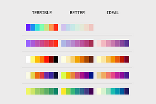
PinnedWeronika Gawarska-TywonekinTowards Data ScienceStart with Choosing the Proper PaletteWhat are the palette types, and how to choose the right one?Mar 10, 20222Mar 10, 20222
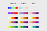
PinnedWeronika Gawarska-TywonekinTowards Data Science3 Tips to Master your Sequential PaletteColor have a crucial meaning in data storytelling. Check how to create a better sequential palette to enrich your story.Apr 20, 20222Apr 20, 20222
PinnedWeronika Gawarska-TywonekinCounter ArtsPoor chart choices that I made so you can avoid themHow NOT to use pie charts, line charts, and bar chartsJul 7, 20212Jul 7, 20212
PinnedWeronika Gawarska-TywonekinAnalytics VidhyaLearn these 10 design principles to take your dashboards to the next level.Dashboard Design Guidelines not only for beginners.Mar 8, 2021Mar 8, 2021
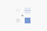
Weronika Gawarska-TywonekinUX CollectiveDefining a chart’s purpose: from good to great charts in just 4 steps#36: Chart’s purposeJun 22, 20232Jun 22, 20232
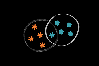
Weronika Gawarska-TywonekinUX CollectiveFrom noise to clarity — how color-coding changes our perception#35: Misleading color-codingJun 16, 2023Jun 16, 2023
Weronika Gawarska-TywonekinUX CollectiveCut to the chase and only show important data#34: Key MessageJun 7, 2023Jun 7, 2023
Weronika Gawarska-TywonekinUX CollectiveIcon charts: examining the hidden flaws and seeking better solutions#33: Icon chart alternativeMay 25, 2023May 25, 2023
Weronika Gawarska-TywonekinUX CollectiveFormat, align, repeat: three steps to master chart labels#32: Label formattingMay 18, 2023May 18, 2023