InHCLTech-Starschema BlogbyHanna BekefiData Visualization in 2023 — Seven Trends to Watch2023 will be less about the technology you have and more about finding better ways to use it to solve business problems and serve users.Dec 7, 2022Dec 7, 2022
InCounter ArtsbyWeronika Gawarska-TywonekPoor chart choices that I made so you can avoid themHow NOT to use pie charts, line charts, and bar chartsJul 7, 20212Jul 7, 20212
InAnalytics VidhyabyWeronika Gawarska-TywonekLearn these 10 design principles to take your dashboards to the next level.Dashboard Design Guidelines not only for beginners.Mar 8, 2021Mar 8, 2021
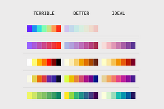
InTDS ArchivebyWeronika Gawarska-TywonekStart with Choosing the Proper PaletteWhat are the palette types, and how to choose the right one?Mar 10, 20222Mar 10, 20222
InTDS ArchivebyWeronika Gawarska-Tywonek3 Tips to Master your Sequential PaletteColor have a crucial meaning in data storytelling. Check how to create a better sequential palette to enrich your story.Apr 20, 20222Apr 20, 20222
InTDS ArchivebyWeronika Gawarska-TywonekThe Function of Color in Data Viz: A Simple (but Complete) GuideEverything you need to know to create vivid chartsAug 31, 20222Aug 31, 20222